3) Mix text and photography.
When novice designers discover the myriad fonts at their disposal, they may be tempted to use as many as possible. However, using too many fonts can make legibility difficult. As a rule, stick to two fonts for each of your pieces: one for headlines and subtitles and another for body copy. Some designers use variants of one font family to add more visual interest without making the piece feel cluttered.
Standard fonts like Arial, Times New Roman, Courier and Georgia with a minimum size of 10 points work well for readability. Using the bold typeface can help separate headers, but beware using italics too often, as readability suffers when italics are used in long sentences.
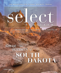
Since photos can sell a trip faster than words, quality photos are important in any online or print piece that promotes your travel program. Ask for high-resolution photos from tour operators pre-trip, then either take photos during the trip or ask for photos from your members afterward.
4: Embrace simplicity.
The golden rule of graphic design is that simplicity sells. Simple fonts and color schemes prevent your piece from looking cluttered and confusing.
This is especially important with e-newsletters because many readers view these on their smartphones. Choose an e-newsletter design that mixes blocks of text and photos in a symmetrical, attractive order.
Instead of text-heavy e-newsletters, when you spotlight a future trip in an email, write a sentence or two, and then link the article to your website for the rest of the information. You want the e-newsletter to look clear and to the point.
In all your mailed pieces, embrace white space. You don’t need a literal white background, but a solid color of some kind that doesn’t detract from the rest of the piece will give your text and photos the breathing room they need to stand out.
The strength of your headline or lead photo to catch viewers’ attention relies on having enough blank space around it. Without white space, the page can look like chaos without a clear message.
After you finish your design, look it over and see what elements you can take out. When designing marketing materials that will stand out from the crowd, less is almost always more.