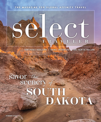
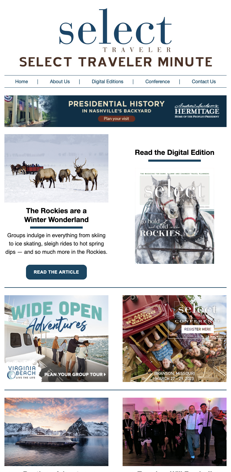
It seems everyone suffers from too much junk mail, both in their physical mailbox and in their email. This surplus of information can make marketing your trips through newsletters or email challenging, since you have to compete with a lot of other organizations’ attractive sales or interesting headlines.
Most of your readers will give your newsletter or email only a cursory glance before deciding whether to toss it in the trash. Fortunately, with a little design know-how, you can communicate quickly to catch your audience’s attention.
With technology and templates, and no formal training, it is easier than ever to create a quality e-newsletter or brochure. But there are some basic design rules to keep in mind to avoid turning your marketing piece into a Frankenstein of mismatched elements.
Implement these design tips into your mailed and emailed materials to capture your readers’ attention.
1) Look for inspiration.
You should never begin laying out a design before first looking for inspiration. Online, you can easily find examples of e-newsletters and travel brochures to discover what types of designs you like and what types you don’t.
Save any design images you like, and then adapt aspects of that look that will work for you. For example, you may love the design of a color block next to a photograph promoting a local chocolate store. Instead of the photo of a chocolate bar, you could replace the image with a gorgeous travel photo and choose text and colors that reflect your company.
Though some professionals are familiar enough with Adobe InDesign or Dreamweaver to construct their own brochures and e-newsletters, many amateur designers will benefit from simply choosing a pre-made template, and then making that basic layout their own through color selections, photography, font choices and other tweaks.
2) Pick a color scheme.
Conversations about color and design can become confusing very quickly. Complications arise from the fact that color choices are subjective, so theories around which colors to use in your communications differ depending on whom you ask.
For beginners, embrace restraint when choosing colors, and stick to two or three hues. Some designers will choose too many contrasting colors, like blue with orange or purple with yellow, to make the newsletter “pop.” However, more subtle color combinations often work best in design, such as multiple shades of the same color.
To decide which colors to use, you could first think of your company’s logo and brand colors. Alumni associations can simply choose the existing school colors and incorporate those into every mailed item.
For travel programs without a set color scheme, online resources such as www.colorcombos.com help generate coordinating colors you can choose from. After determining the exact color combination for your brand, find out the colors’ exact hex codes and store them on your computer. That way, the next time you design marketing materials for your travel program, you can just copy and paste them into any design tool. Keep the colors consistent in all your marketing pieces for brand recognition.


